The Akshata.
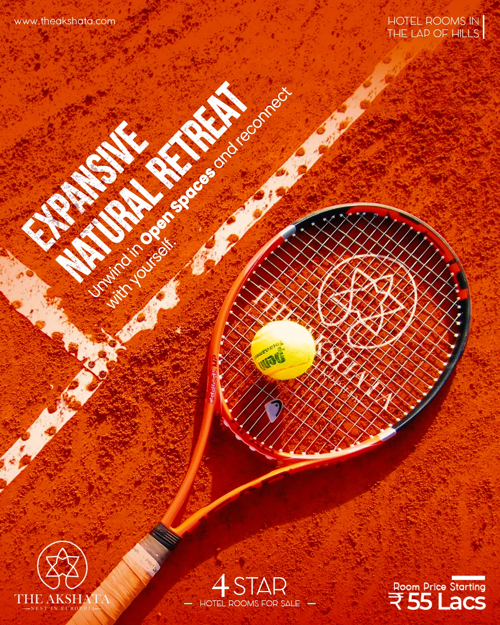
A calm, premium identity for a hill property, carried across every post and print piece.
- Client
- The Akshata
- Industry
- Hospitality
- Where
- Himachal
- Year
- 2024
The challenge
One look that feels premium everywhere: social media, signage, menus and print. Before this, every touchpoint looked like a different brand.
What we did
- 01
Audit
Looked at how the property showed up on posts, signs and print. Spoiler: five different brands.
- 02
Identity
Built a mark, colours and type that feel calm and expensive, never loud.
- 03
System
Turned it into templates the team can use without calling a designer.
- 04
Roll-out
Social posts, stationery, signage and print, all in one voice.
The outcome
One recognisable look across every touchpoint, and a template kit the team actually uses.
Work
9Want something like this?
Tell us what you're working on. We reply within one working day.
 Next projectDevelopment site IM